Showing posts with label artist. Show all posts

Saturday, 3 January 2015

Halcyon Gallery - Dale Chihuly "Lumiere"

Halcyon Gallery - Dale Chihuly "Lumiere" 


Before the start of the new term, i had arrived to London early, sending time with the family before sending my little brother off to school in North Yorkshire. 

We came across the Halcyon Gallery in the evening and the interior was glowing, you could see the illumines-sense from the outside 
This immediate turned our heads as it caught out attention 

Inside was an exhibition exhibiting Dale Chihuly, who in this series of work made Acrylic Light Drawings!


Lumiere is the first exhibition of Dale Chihuly's Acrylic light drawings. 

This style of his has been developing throughout his carer. "Beginning as illustrative tools used to direct and inspire his visions for glass - his drawings have become increasingly important as independent outlets for his expressions, whilst simultaneously providing a vital means for him to release his energy" 


His work is very expressive and abstract

From the light, you could see almost completely through the acrylic paint, which gives the audience a visual texture. Like there a more mark makings within the marks itself!! Brilliant concept 

"Somebody once said people become artist because they have a certain kind of energy to release. That rings true to me. it must have an outlet. Thats why i draw" - Dale Chihuly


 Chihuly's Work has no direct link to my work
Yes it is colourful but the  is somewhat different. Mark makings are in few aspects similar. 

It is however very interesting to see this kind of concept. this new innovative idea being processed and seen. Very interesting


Not only paintings but sculptures too. 
They make wonderful interior designs and possibly an iconic feature 


The overall curation of the place was impressive. 

I enjoyed this show very much. 


Friday, 5 December 2014

Gallery visits December 2014

Gallery visits December 2014

Tate Modern : Sigmar Polke

When we went to these gallery visits as a group, we scouted out the symbols and context that had a strong relationship with "Appropriation" which was the topic we were discussing about


This piece was interesting, painted on bubble wrap, found material. Raw material


The Swastika originally was considered to be a very sacred symbol in Hindusim, originally perceived as a symbol of success and promising fortune. It was later appropriated and altered by the Nazis. 
Other things like the symbol of the Eagle, used in the Nazis as a symbol of strength is now also used in todays world, American symbol too. 


Tate Modern: Omer Fast - "The Casting"


This was a really interesting piece, 4 videos being projected onto both sides of the 2 slides, a story was being told. Composition. 


Serpentine Gallery: Reiner Ruthenbeck


Lots of found material used by Ruthenbeck


Tables, paper, rope, everyday items altered and recontexualized for the viewers. 
It changes your perspective on how you see the subjects. 

Tables aren't usually seen from this angle 
And even if you have the urge to fix it, you can't because there is a line that prevents you from entering. 


Serpentine Sackler Gallery: Julio Le Parc


Parc uses a lot of political figures in his work but he alters them to make it playful and less serious. 


He made games for all ages to interact and play with. 

All this research and gallery visits brought us onto our presentation in which we made for the unit. 


 Our presentation went rather well in my opinion. Really well
We talked fluidly about the subject of appropriation and when it got to the questions part at the end, this subject brought in many questions. 
The discussion between us nearly went on longer than the presentation itself.

Overall this was really beneficial, it extended our knowledge on the subject of appropriation, it brought different views and opinions together that helps with our perception of different kinds of views on appropriation which will help develop our practice. 


Thursday, 20 November 2014

Creative Enterprise Week 2014 - Sell Yourself: self-promotion and marketing

Creative Enterprise Week 2014 - Sell Yourself: self-promotion and marketing

Made in Arts London are my current agent and they sent me an email a few weeks ago regarding talks that were coming to London

This is one of the few i went to

There were two speakers at this event

I found this talk to be rather helpful 


I wrote down some helpful notes
Starts on the right hand side


Key points on the right !


Gallery Visits since October '14

Gallery Visits since October '14


I haven't been to many galleries since I've been back, i am more focused on my practical work because this time, i actually have a focus on what i am doing. Last year was more or less experimentation which was a very spread out approach on my practice. 


This exhibition was really helpful to my practice, and toward sky knowledge of Appropriation. The artist that were exciting in this show were all more or less inspired by Marcel Duchamp. Majority of pieces exhibited were all "readymade" objects, what the artists had done was alter the properties and gave new meaning to the objects, they recontexualized. 

One of my favourite pieces in this exhibition was a piece done by Rob and Nick Carter, a piece called "Red 23, 2014". This was a french roulette wheel, that kept on spinning. They had added a motor to it, with its ballbariane inside never landing on a figure, it was interesting to see its original function, functionless. This kind of recontexualising interest me towards my theory and practice. 


This was a small gallery near Brick lane market, where i was doing research for my paintings 


It was helpful in the sense that the artwork captured this street vibe, it expressed the marks on a rough surface. You had the feel of an urban setting. 


Andrew Salgado, his work was very good to see
His paintings varied in different sizes, his paintings of portraits using a wide range of brush marks was inspiring to see. 
It was aesthetically pleasing, i was so interested in his work in fact, i asked for a price list for his pieces, if there was one in my budget, i wouldn't mind investing in one of Salgado's pieces. 


Price list 


Another exhibition we came across when walking about London 


I think the gallery visits so far, haven't been useless but not entirely useful to the subject of Appropriation. 

Wednesday, 12 November 2014

New "Brick Lane Market" Paintings, 2014


New "Brick Lane Market" Paintings, 2014


These paintings went a lot better. I feel more comfortable knowing what i am doing now in my practice, its been a while since i have created work this fluidly. 
I Dont actually plan what i am going to paint, i look at my research and decide then and there. Colour is a factor when thinking, i tend to choose darker colours now for the background therefore the brighter more vibrato images in the foreground will catch more contrast. 

Somewhat automatic choosing 


"Brick Lane Market #3, 2014"


Not everything is appropriated. I have actually created some things on my own. Like these vomit like patterns. That was my own interpretation of what i thought would look good in this painting. The directions guides the viewers eyes throughout the whole painting. This is good 

This is more playful, makes you happy and energetic. Positive energy is radiated form this kind of painting which is why i enjoy creating it


"Brick Lane Market #4, 2014"

This piece seems rather chaotic  
Lots of things happening, many subjects within the image, especially the foreground with the 5 horsemen riding around the painting, like a tornado of activity and colour overwhelming the audience. 

 "Brick Lane Market #5, 2014"


This piece i actually think went better than the previous two. The triangular patter is a definite positive that went well. It flows through the whole painting which connects everything together, bringing it into one to the audience. 
Colours are bright, like sun like bright. Feeling of it is light. 
Compositions isn't too bad, In this piece, i decided to use more image than text. 

The start with Brick Lane Market #1 and #2, i used around 70% image and 30% text. 
In the others like "Alleyway: and "Berwick Street" i used like 70% text and 30% imagery. 

I wanted to create balance. 

In this i tried to go for a 60% imagery and 40% text 


Tuesday, 11 November 2014

New Paintings : "Alleyway, 2014" , "Berwick Street, 2014" , "Deptford Market, 2014"


New Paintings : "Alleyway, 2014" , "Berwick Street, 2014" , "Deptford Market, 2014" 


This is the general view of the overall piece

I started doing this with Bricklane Market #1 and #2, and i thought it was a change and made it look very interesting. 
It can link to the streets of London as it has a similar visual appearance to a brick on a wall. 


"Alleyway, 2014" 


I was walking in london and i came across an alleyway that was kind of grim and dirty. No body gave it a second look, which i am not surprise but the artwork in the alleyway should be recognised. I used the images and text in this alleyway to create a painting that will look aesthetically pleasing, hopefully changing viewers minds and giving street art a second look whenever they see t in whatever situation. 

I am rather fond of this piece, Many things worked well in this. The paint splatter gave it this spray can feel to it and freedom of expressing on a surface. 
In the background i started painting texts that i found, then in the foreground i used this symbol. 


"Berwick Street, 2014" 


This was not a market nor an alleyway. It was a street. 

I wouldn't say this piece was very successful but it was good that i did it, to learn what went badly and what went well 

This compared to my other pieces feels less vibrant in colour use. 


"Deptford Market, 2014" 

This piece went the less successful 
Very plain, simple, empty
Feels lost in text and colour 
There is not as much depth in this painting because the background colour is similar to foreground image colours. 
 I will continually paint 
Next will be more Brick Lane market paintings. I feel that this market had a brilliant balance between text and imagery. I went to do research there twice and did a lot of research! 


Monday, 10 November 2014

David Choe : An inspiration towards my practice


CONTINUING WORK - 2ND YEAR CHELSEA COLLEGE 

This is an artist that has inspired me through my new series of work in my current practice. His name ladies and gentleman is David Chow. He is a Graffiti artist that has made a name for himself after his commission with Facebook in which he took shares instead of cash, because of Facebook's success, his shares are priceless. 

His work however are too priceless. 


Ive always loved colour, in these pieces, the overall use of colour and colour combinations creates nothing but positive energy when viewed upon. Vibrant and energetic. 


He always has a main subject composed into the image, but surrounded with other visual elements 


His style is so free, variation of movements and use of colour interest me


He is the main artist i have been looking at at being inspired by his work i have decided to create some of my own. 

I continued doing what i did from my last piece. Concentrating on the Graffiti/Street art in London Markets and also unnoticed places such as alleyways, corners and remote locations. 

My first piece was "Bricklane Market #1, 2014" 

Personally i think these pieces work really well. There is a strong depth in the image, and colour use is strong and vibrant. Very aesthetically pleasing to the viewers because it catches their attention. 
 These two pieces i made at similar times. They have a similarity through the use of colours and composition of images, and the balance between text and imagery. 


Saturday, 18 January 2014

Painting of my Brother


Painting of my Brother

This was a day painting. Interested in a south east asian artist named Attasit Pokpong

He believes that a facial expression is a window into the soul

I like this saying and believe it to be true

I was inspired by this and followed his technique with the background, single toned colour, but i changed the style when it came to the face. I added a lot more colours, in a rather random notion. I wanted to see what effects the colours would have on the viewers. 


Let me know what you think

I plan to change this technique i used and develop it more. Too many colours in my opinion. or is it?


Wednesday, 10 April 2013

Central Saint Martins - My Foundation Year

Central Saint Martins - My Foundation Year 

Im only going to do one blog entry about my entire foundation course at Central Saint Martins showing you only a few pieces of work that i experimented on and what i ended up focusing on. 

I decided to do a foundation year because i truly didn't know which area of art i wanted to pursue in, i mean i liked all the areas. Product Design, Architecture, Landscape design and Fine Art. 

As the course went on i steered towards Fine art, however i didn't steer towards one principle, i worked with all the principles involved in fine art. 

Just one example of a sculpture i made, i was working and merging domestic products and fusing them together to create something out of the ordinary, in this piece i wanted to see how people would react to this product, Would they still carry it like a beer or use the handle? 

Sculpture:


I also did some photography, in this piece i was inspired by the controlling affects of colour, the colours came from a traffic light but the idea of this was: do the colours make you think a certain way about a photograph? 
The subjects within each photograph are rather random, but the focus is on the colours. 


What does red make you think, yellow? blueish green?
Every individual colour makes you think of something, an emotions a meaning

Below i try to further prove that point 


Do these seem right to you? Thats the point. 

A few drawings:

Lined drawings


I also experimented with technology and media.
What i did in this series of work was use technology to text someone a question. I would then receive a response. 

This question was "Would you ever kill someone?"


"What would you do if there was no internet tomorrow? How would you react?"
"


"What gets you out of bed in the morning?" 


"What is missing from your life?"


"What was the worst thing that happened in your life?"


Before this foundation course i was painting, this year i tried to stay away from painting. I wanted to explore all other aspects of art therefore i barely painted. 
As i progressed, i ended up doing something i found really fulfilling. It was installation. 

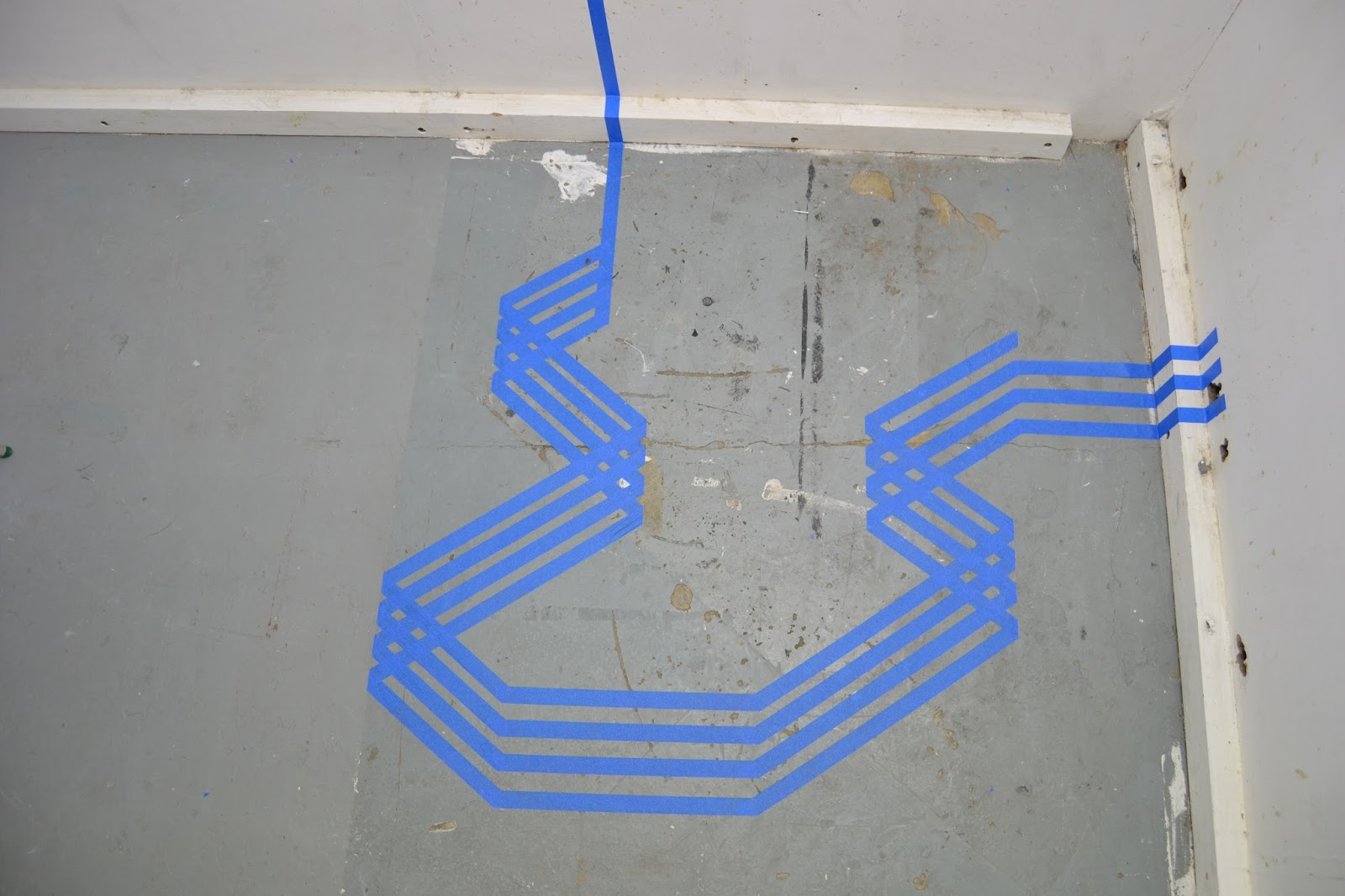
My main medium was masking tape, coloured making tape. and my number was 4. In a sense i was trying to create a painting on the site i was in using coloured masking tape. 
Abstract, Painting, Installation site specific. 

This was my first test piece. 
I believe this piece was with red insulation tape.


It is a very precise process, everything has to be measured and spot on. 
Cutting the masking tape needs to be done with a sharp knife for a crisp edge. 


What i like about this is that it creates space in space. The wall is a big empty space, but in that space is a whole other dimension of space. 
This is what i was going for. 

More installations: 


More:


One more: 


This i photoshopped, I wanted you to understand what i was aiming for, space inside space. 


and for my Finale piece i used the exhibiting space for our final year show and worked in the site provided to us. 

First to inspect the site, see what I'm working with/on.


Checking to see if the masking tape sticks nicely, incase i need to sand down the walls..


Doing some repair work. 


Getting started 


Working onto the window too, part of the site 


Crisp edges 


Precise measurements 


And here it is, this was new for me, one of my very first times doing an installation piece, took me out of my comfort zone which was great. Here goes the end of my Foundation Diploma at Central Saint Martins, London, UK.